
When I launched my Shakespeare blog in 2005, I didn’t have my own Shakespeare Geek logo. I knew I’d be doing this for a long time, and I wanted to carve out my own unique space and voice in what people no doubt saw as tedious, centuries-old academic drudgery. That’s not what I do this.
Why I Ditched the Traditional Droeshout Portrait

Like most Shakespeare sites, I initially used the traditional portrait of William Shakespeare for the Shakespeare Geek logo. However, I really didn’t like the ubiquitous Droeshout engraving that appears on virtually every Shakespeare-related website, book cover, and educational material. While historically significant, the Droeshout portrait just screams “public domain”.
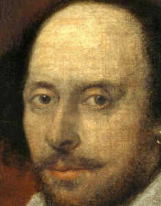
Instead, I chose the Chandos portrait for my early branding. This version, housed in the National Portrait Gallery, offers a more human representation of Shakespeare. I especially appreciate the earring. Just that hint of rebellion.
The Einstein Inspiration: Adding Personality to Shakespeare

As my blog grew, I realized I wanted the Shakespeare Geek logo to be something that truly reflected our unique approach to Shakespeare. We weren’t just another dry academic resource – we were bringing humor, accessibility, and genuine enthusiasm to the study of the world’s greatest playwright. The logo needed to match that energy.
The inspiration struck when I remembered the famous photograph of Albert Einstein sticking his tongue out at photographers on his 72nd birthday in 1951. That iconic image transformed the perception of one of history’s greatest minds from intimidating genius to playful human being. I thought: what if Shakespeare could have the same approachable, mischievous personality?

From Concept to Creation: Crowdsourcing the Design
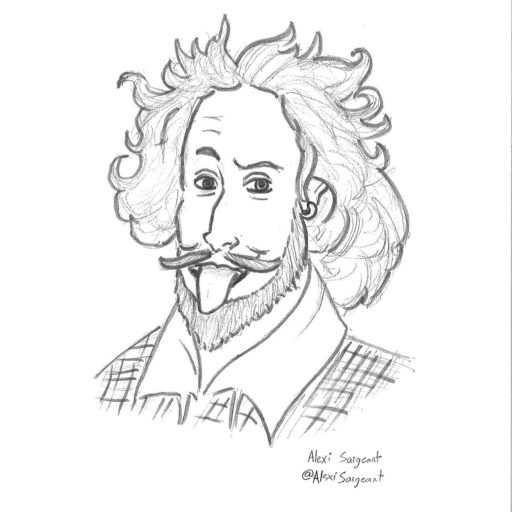
Rather than hire a professional designer immediately, I turned to my blog followers for help. I explained my vision of combining the Chandos portrait with Einstein’s playful tongue-out pose, and asked if anyone could create an initial sketch.
The response was fantastic. Long-time follower Alexi Sargeant took on the challenge and created the first version of what would become the Shakespeare Geek logo. He skillfully merged the recognizable features of the Chandos portrait with that playful, tongue-out expression that says, “Shakespeare doesn’t have to be stuffy.”
Commissioning the Professional Logo
While the initial sketch captured the concept perfectly, I knew I needed a professional version for long-term use. I commissioned a graphic designer to refine the concept into a clean, scalable logo that would work across all applications – from website headers to merchandise.
The final logo maintains the essential elements of the Chandos portrait while adding that crucial element of whimsy. Shakespeare’s tongue-out expression suggests that studying his works should be fun, not intimidating. It perfectly embodies our philosophy that you can be both scholarly and playful when it comes to appreciating the Bard.
The AI Era: A Photorealistic Experiment
With the advent of generative AI technology, I couldn’t resist creating a photorealistic version of our tongue-out Shakespeare. Using modern AI image generation tools, I produced a remarkably lifelike interpretation of what our playful Bard might actually look like.
While fascinating as an artistic experiment, this AI-generated version remains just that – an experiment. The original illustrated logo remains our official brand identity. There’s something about the hand-crafted, artistic nature of the original that better represents the human creativity and passion behind both Shakespeare’s work and our approach to sharing it.
Why Branding Matters for Educational Content
The evolution of our logo illustrates an important principle: how you present educational content is almost as important as the content itself. In a world where Shakespeare is often perceived as intimidating or irrelevant, visual branding that says “this is approachable and fun” can make all the difference in reaching new audiences. Sometimes, all it takes is a wink and a stuck-out tongue to bridge the gap between then and now.
The Continuing Evolution
While the core logo remains unchanged, it continues to evolve in application and context. From social media avatars to conference slides, the playful Shakespeare serves as a consistent reminder that learning about literature should never lose its sense of joy and discovery.
As we move forward, the Shakespeare Geek logo stands as proof that you can honor tradition while embracing innovation, respect the classics while making them accessible, and maintain scholarly integrity while never forgetting to have fun.
After all, Shakespeare himself was writing for popular audiences, filling his plays with humor, wordplay, and entertainment. Our tongue-out logo reminds everyone that the Bard’s original intent was never to be boring – and neither should our approach to studying his incredible body of work.
The Shakespeare Geek logo represents our commitment to making Shakespeare accessible, enjoyable, and relevant for modern audiences. Whether you’re a student, teacher, or lifelong learner, remember that the best way to appreciate great literature is with both respect and a sense of humor.