
Hi Everybody,
Hopefully everything’s settling in nicely to our home on WordPress. I’ve spent most of my time making sure that 11 years worth of links aren’t 90% broken!
One of the main reasons to move off of Blogger was to take advantage of those features that are expectations of a modern blog, and one of them is better control over the appearance. Right now we’re using a theme called Penscratch which I was using on my other sites Shakespeare Answers and Not By Shakespeare (both of which now redirect here, by the way). I chose it because it reminded me of the written word, crisp type on a white background.
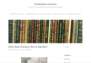
Now that I’m in it 100% of the time, I’m wondering if it needs something. I’d like to see some more color and images as part of the main browsing experience. This theme does have the option of a “header” graphic – which appears in a horizontal bar under the title, and I wasn’t thrilled with it. There’s also a “background” graphic which I couldn’t figure out how to work because every time I tried to set it, it hid everything else.
What do you think? Are there readers out there more familiar with the “standard” in WordPress theming that could offer some suggestions about ways to decorate? I’m open to ideas!
I like the theme, simple, not a lot of distraction, because, “the play’s the thing?”
If you have WP questions, I’ve been at this for a spell.
It’s not easy to decide. It can easily get “too crowded” at the blog with a lot of pictures in the header, at the side menue, in the blogposts, … I have got an header and stuff and I am quite happy with mine now, as my blog is more like a playground for me, a little Shakespeare-diary to remember things… So I think the little chaos fits to my blog: https://claowue.wordpress.com
Here, a header pic might be too much distraction for your blog as your blogposts have more substance and should be in the focus. I like the simpleness of the optic of your blog. Sometimes less is more.